Seattle-Monroe Reptile Zoo
Isometry meets Reptiles
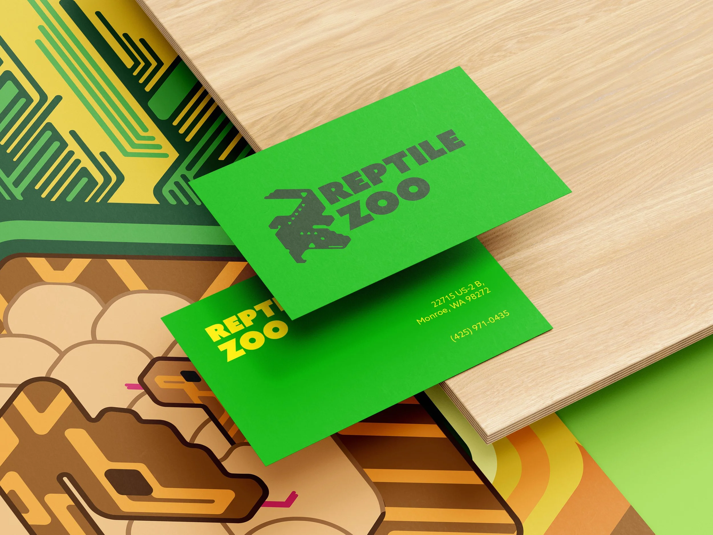
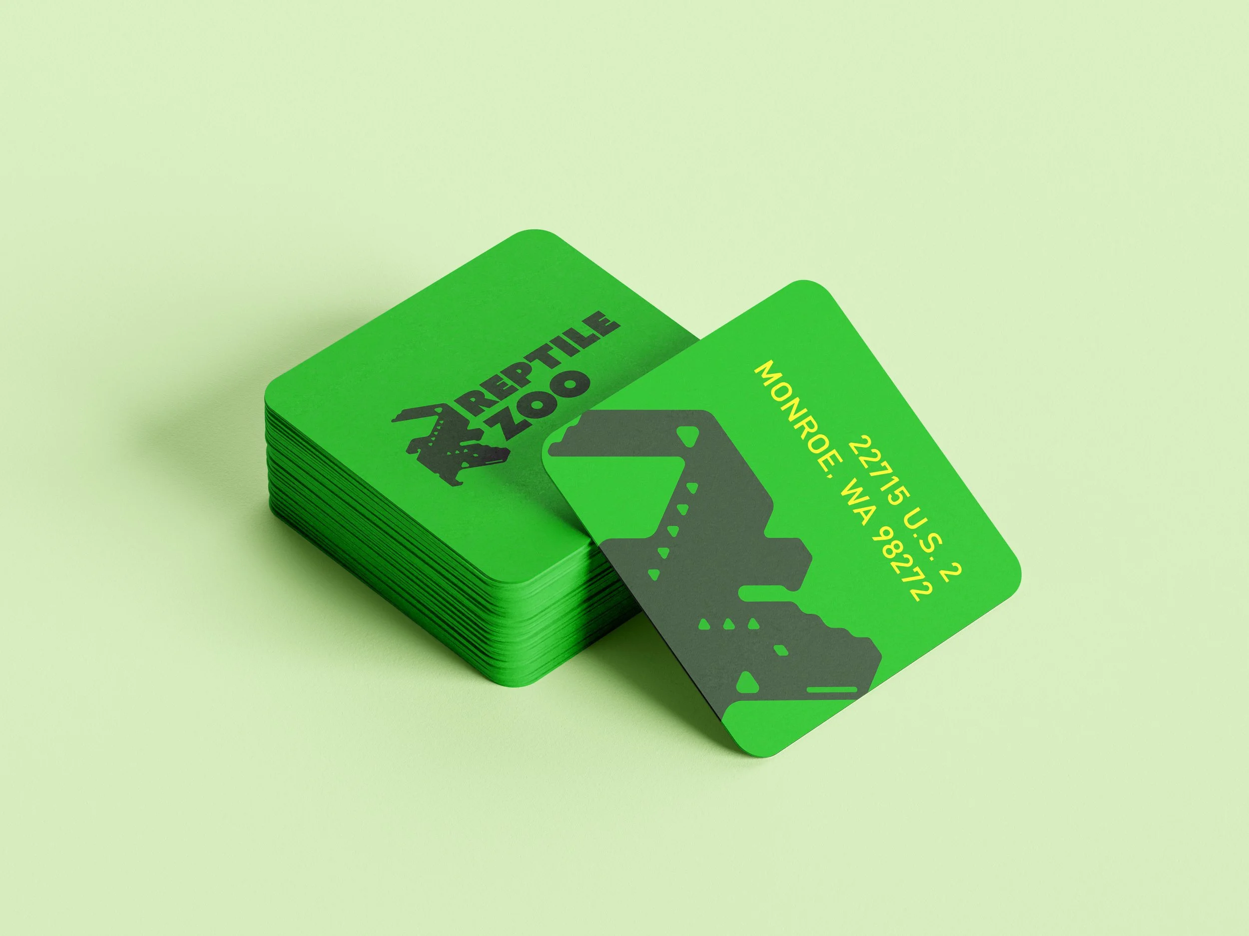
For this project, I developed a dynamic rebrand for a Reptile Zoo, using an isometric grid to create a structured yet engaging visual identity. The design highlights the zoo’s most unique inhabitants—an albino alligator and a two-headed turtle—through thoughtful color choices and geometric forms that bring their distinct characteristics to life. As part of the assignment, I also designed a custom modular typeface, reinforcing the brand’s modern and structured aesthetic while maintaining an organic connection to the reptilian world. The result is a bold, innovative identity that balances precision with personality, making this branding as extraordinary as its creatures.
BRANDING



ICONOGRAPHY

Icons, Colors, Shapes
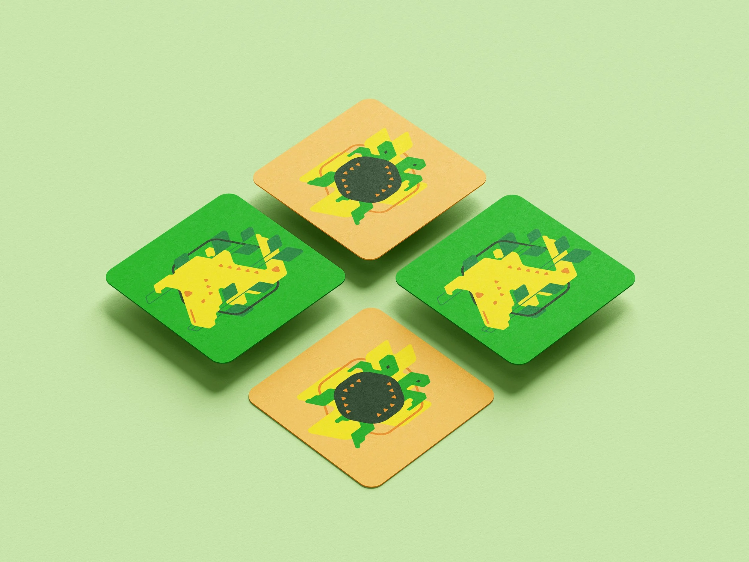
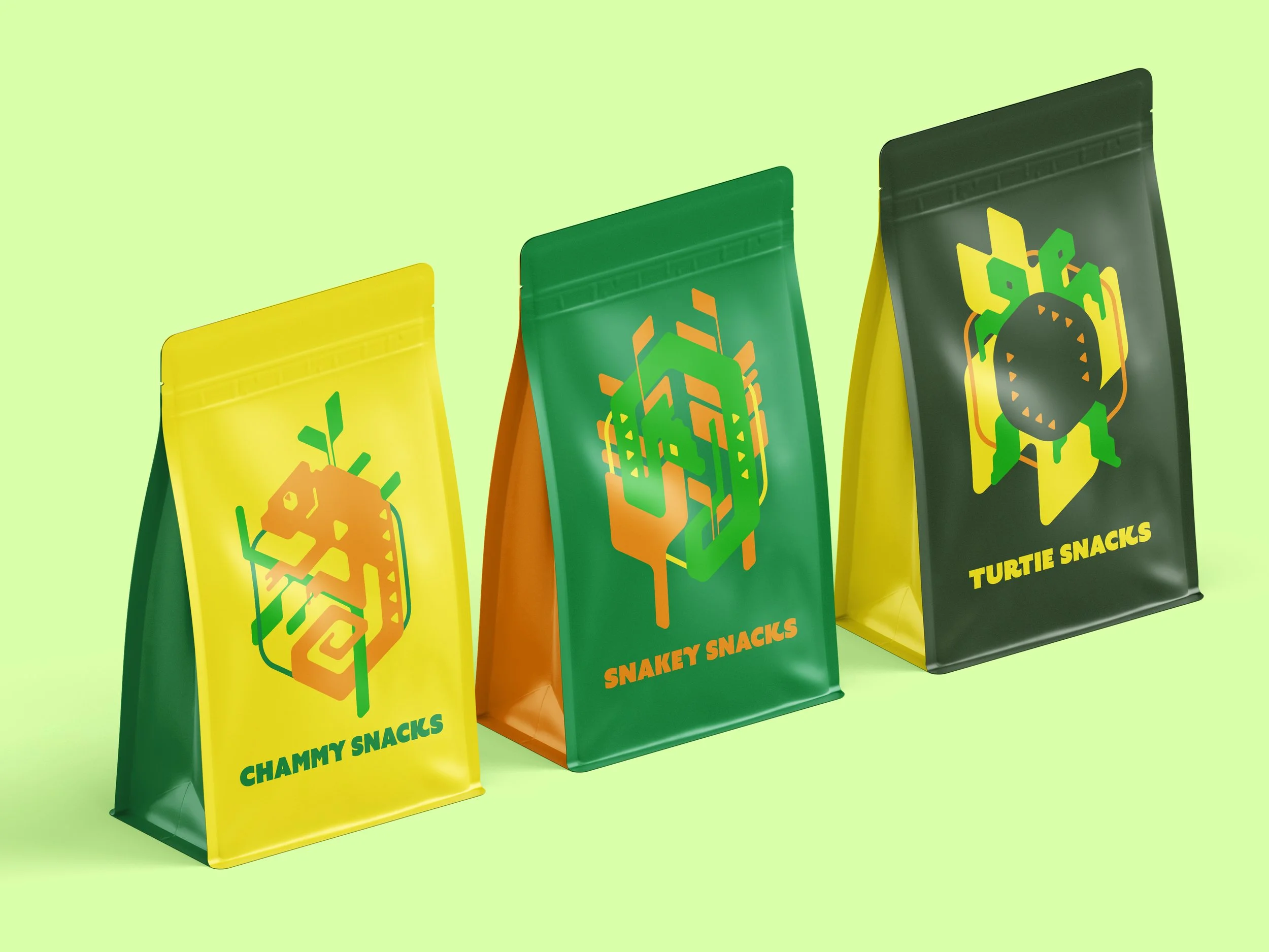
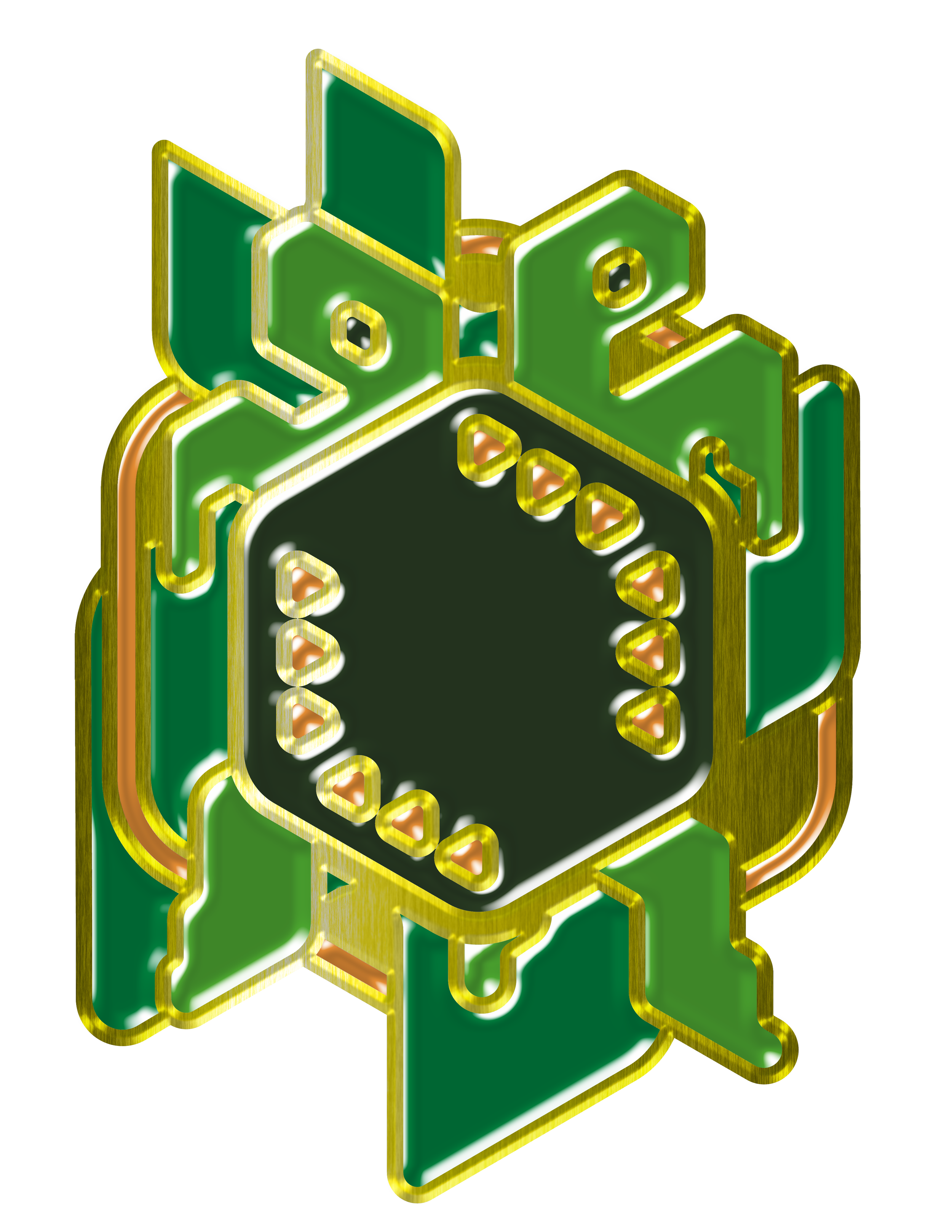
For Monroe Reptile Zoo, a set of four custom geometric icons was designed to showcase some of their most distinctive animals: a chameleon, a snake, a two-headed turtle, and an albino alligator.
Developed on an isometric grid inspired by Seattle’s architecture, the icons combine playful geometry with modern design aesthetics. They were intentionally crafted to be appealing to kids and younger generations, while maintaining a stylish, contemporary look that also attracts modern adult audiences.
Each icon is modular and color-adaptive, allowing the palette to be adjusted to reflect the authentic patterns and hues of the animals they represent. This flexibility ensures the system feels both engaging and versatile.
The outcome is a visual identity that is educational, vibrant, and inclusive, supporting the zoo’s mission to inspire curiosity and connect visitors of all ages with the reptile world.
SPECIAL PRODUCTS

Promoting Care
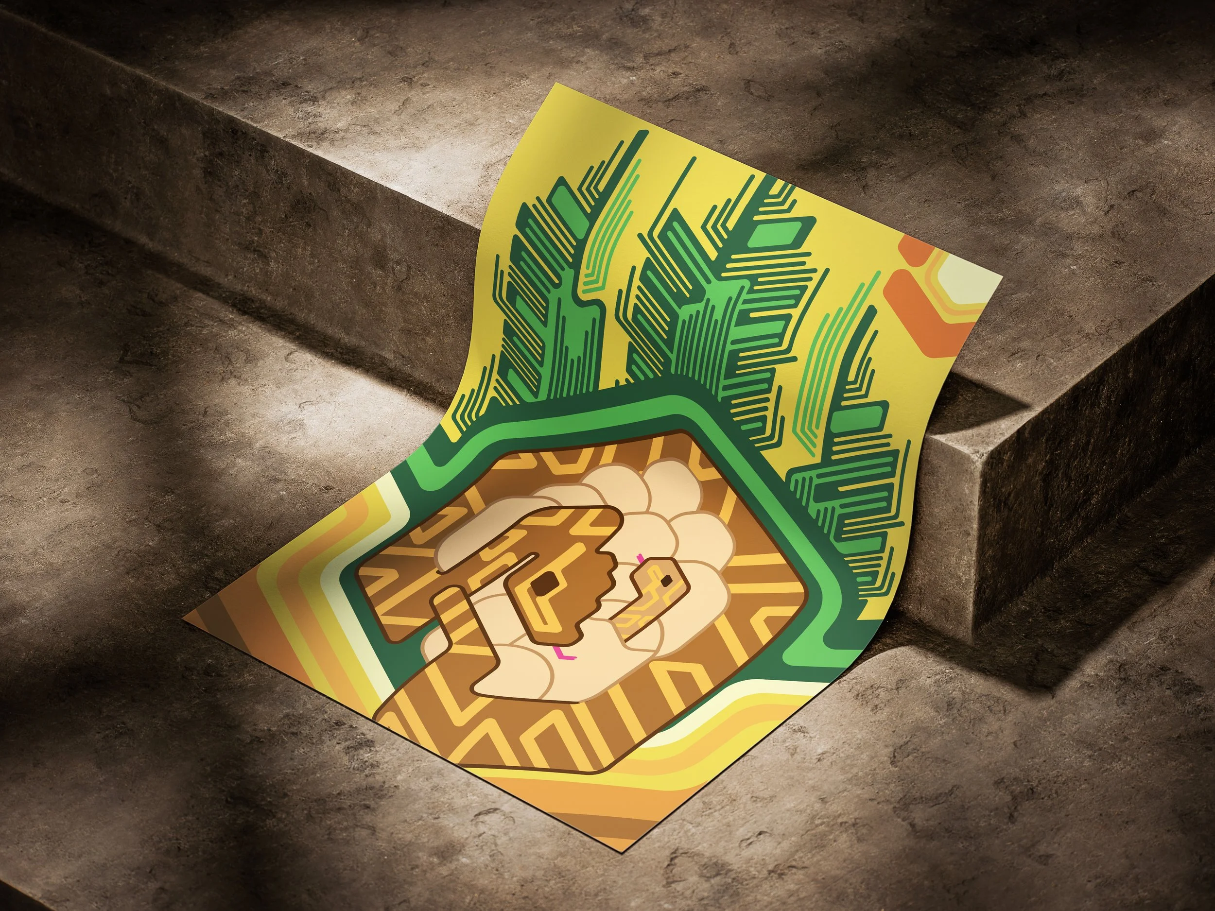
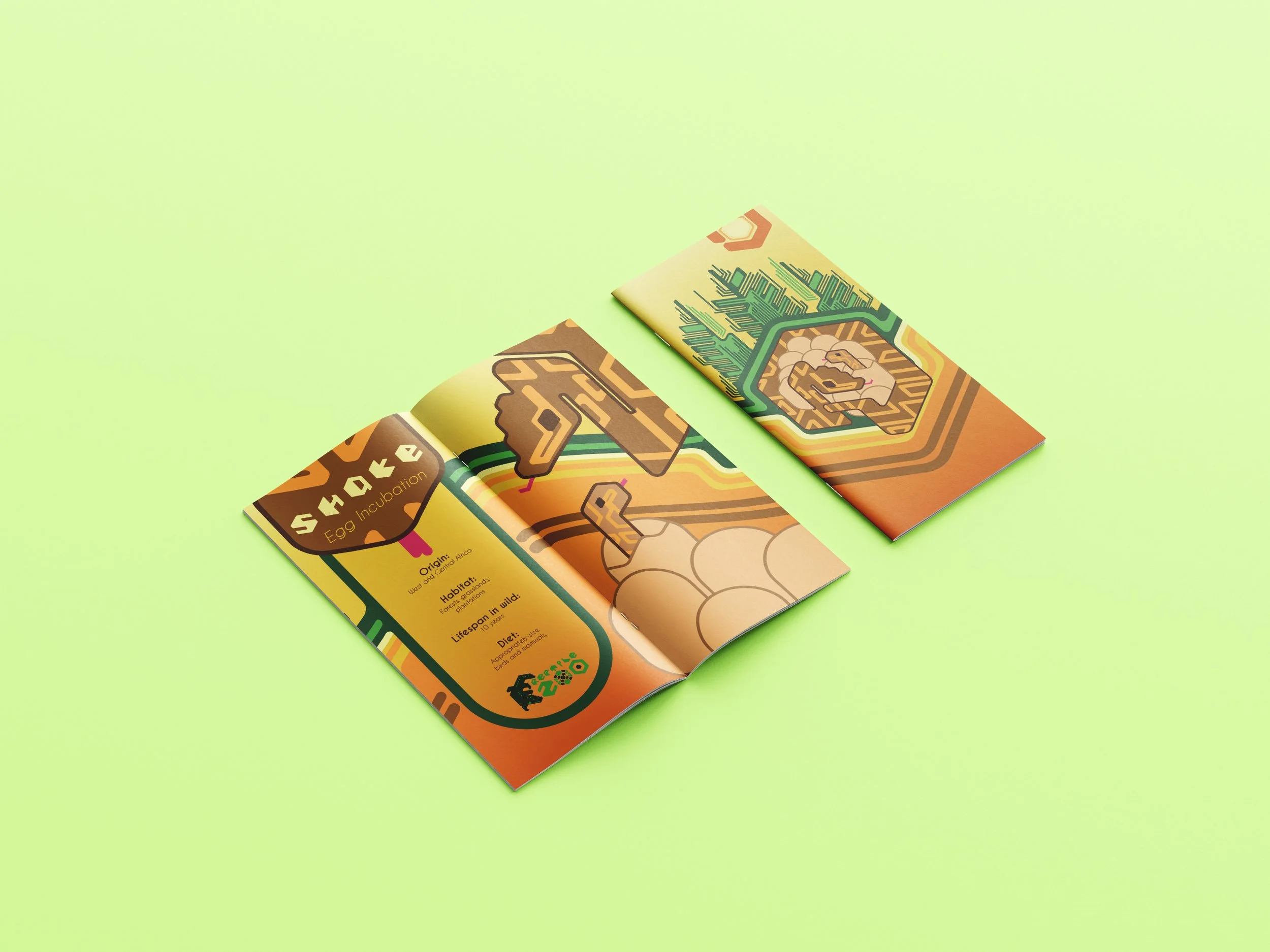
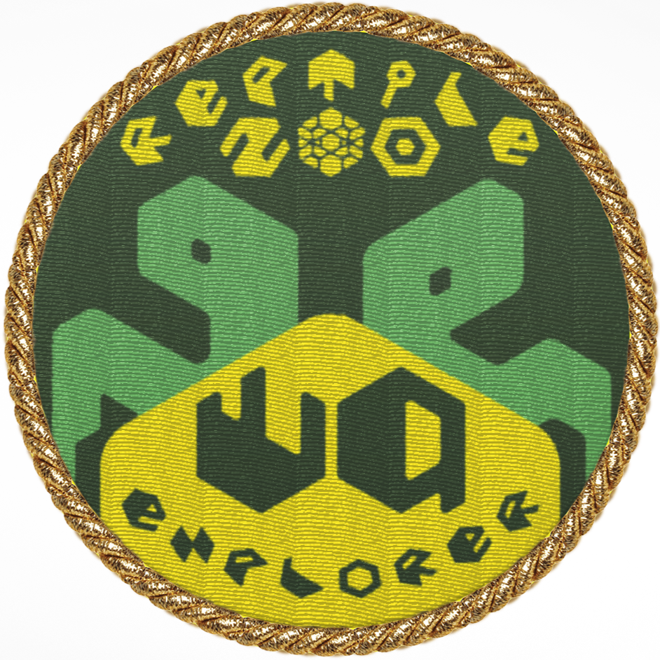
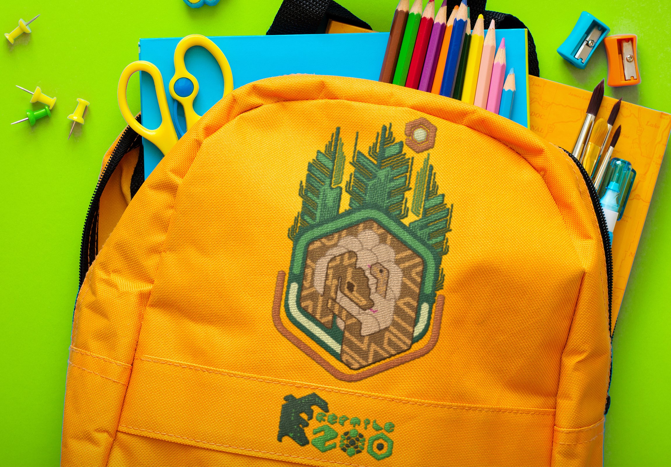
Several design iterations were developed to support Monroe Reptile Zoo’s Reptile Adoption Program, ensuring the visuals could communicate both education and engagement. The goal was to create a system that felt accessible and exciting for families and younger audiences, while still maintaining a polished, modern style that would resonate with adult supporters. Through multiple rounds of exploration, the icons and branding elements were refined to highlight the uniqueness of the animals available for adoption, helping the program feel both memorable and meaningful.
MERCHANDISE



ONLINE & OFFLINE
PRESENCE
FROM THIS

